By Kari Chisholm:
One thing's for sure: mobile ain't going away.
In the last year, website traffic from mobile devices has doubled. Mobile traffic to corporate sites is now up to 11% of all website traffic.
But the mobile revolution has largely been ignored in the world of politics. Sure, we're all using mobile devices - and nearly every campaign is active on Facebook and Twitter. But an astonishing number of campaigns are still running websites that aren't optimized for handheld screens.
Here at Mandate Media, we set out to change that this summer.
We're thrilled to announce that Mandate Media is (as far as we can tell) the first Democratic digital firm to roll out mobile-optimized sites to our entire client base - a shift that we've already completed for all of our 2012 federal and statewide clients.
Here's what that responsive-design approach looks like for our client sites:
-
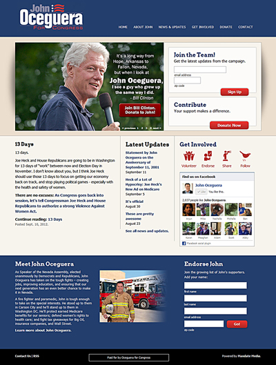
If you visit with your desktop computer or an iPad, you see a full website.
-
If you visit with a mobile device, you see the same content, but with the navigation, design, and typography optimized for mobile. In short, a mobile design pulls everything into a single column, tightens up navigation, and makes the site taller while ensuring that critical stuff is in the first "screen-ful".
-
And here's the best part: If you're on your mobile device, and you share a link with a friend, that friend will also get the right view for their device. (As opposed to seeing the mobile view on their desktop - ick!)
Here's an example from John Oceguera for Congress.
Mobile Site

Desktop Site

Posted by Kari Chisholm on September 19, 2012 | See full archives


 Tweet this!


